Moody Bedroom Designs With Dark Accents: Where Intention Meets Atmosphere
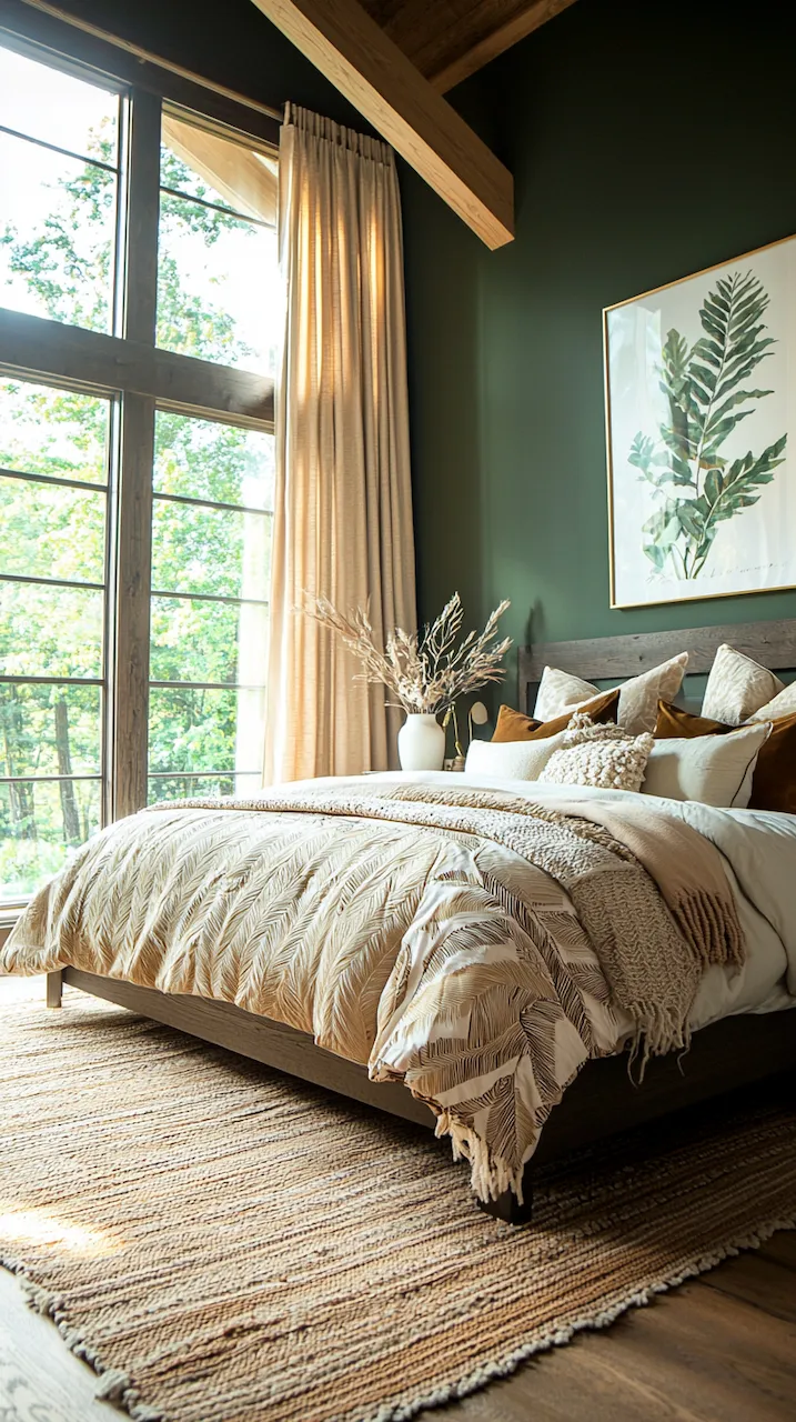
In the lexicon of design, moody used to be a euphemism — code for dim, heavy, or vaguely gothic. But in 2025, moody is a moodboard of self-awareness. It’s about restraint with purpose, shadows with structure, and spaces that seduce the senses without drowning in drama. When done right, a moody bedroom isn’t just an aesthetic — it’s a manifesto in mattress form: confident, curated, and entirely your own.
We’re in a cultural moment where “good taste” is no longer enough. The real luxury? Rooms that read like essays. Bedrooms that blur art and function. Dark palettes that don’t retreat but assert. This is smart design — where each piece, pigment, and texture earns its place, and the final composition tells a story as compelling as a well-cut film noir.
Statement Meets Structure
The magic of moody bedroom design lies not in throwing paint on the walls or dimming the lights, but in the architectural decisions that underpin mood. In design, moodiness is less about melancholy and more about depth: emotional, visual, and structural. To create a space that feels intentional and layered, every element must be considered with the precision of a sculptor.
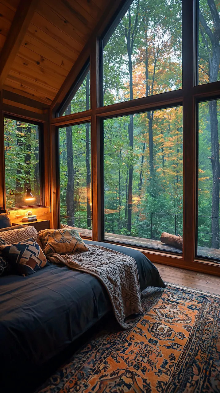
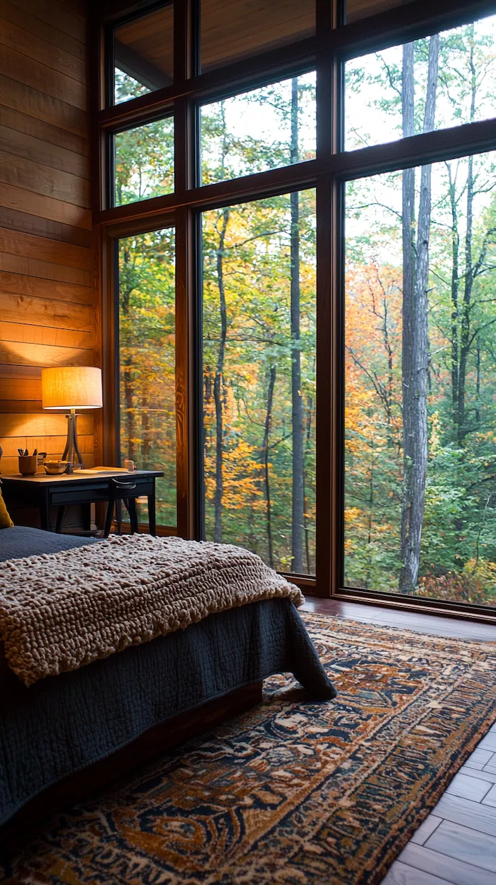
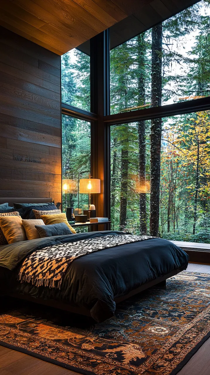
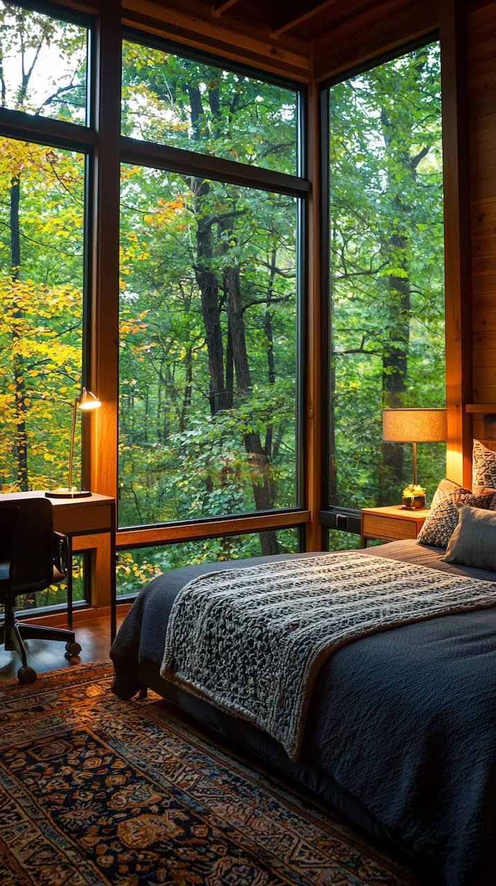
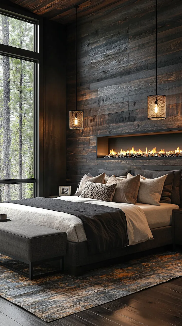
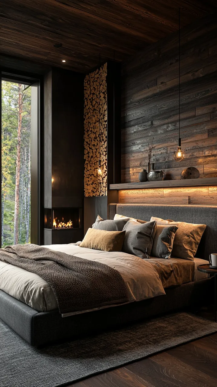
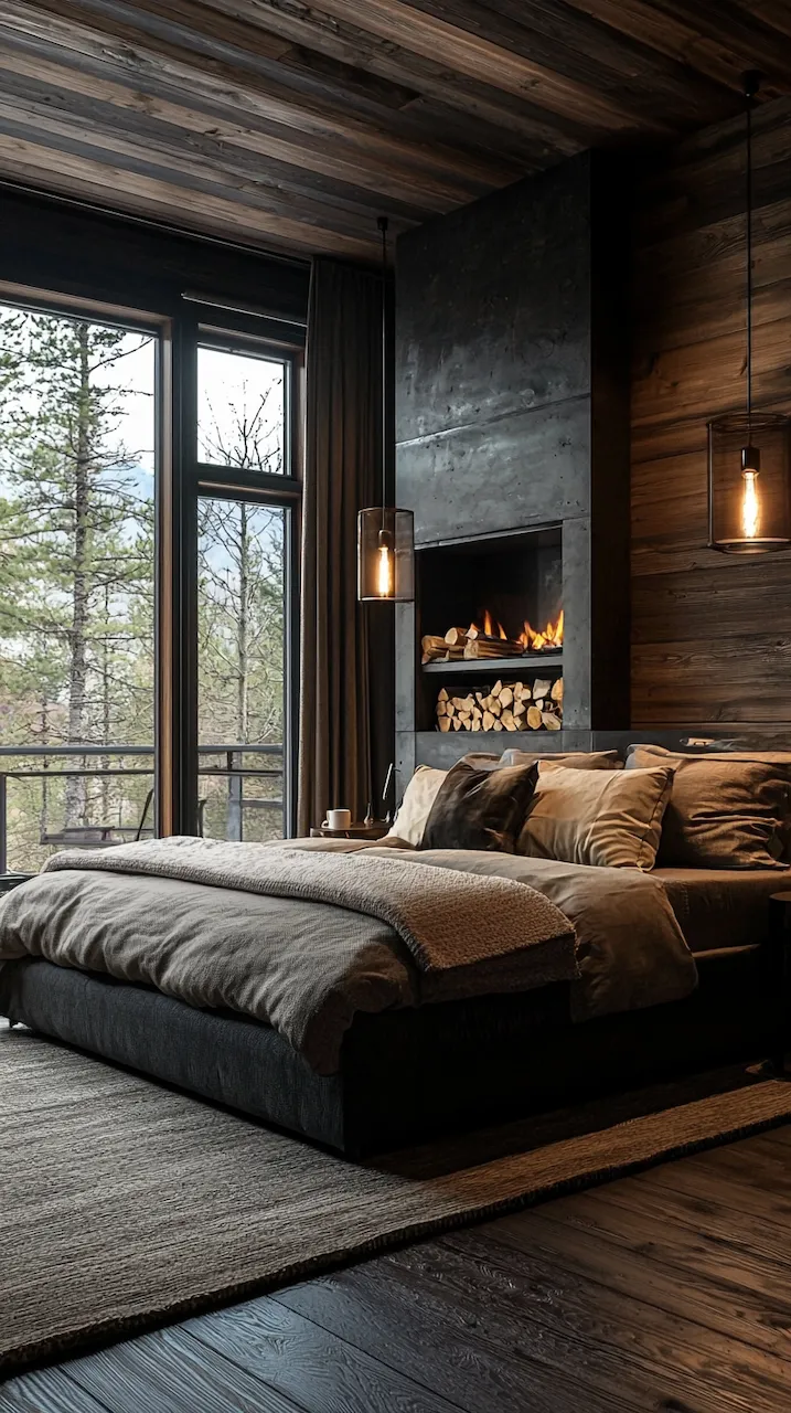
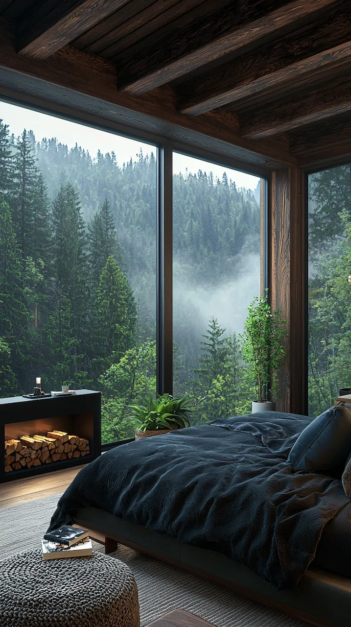
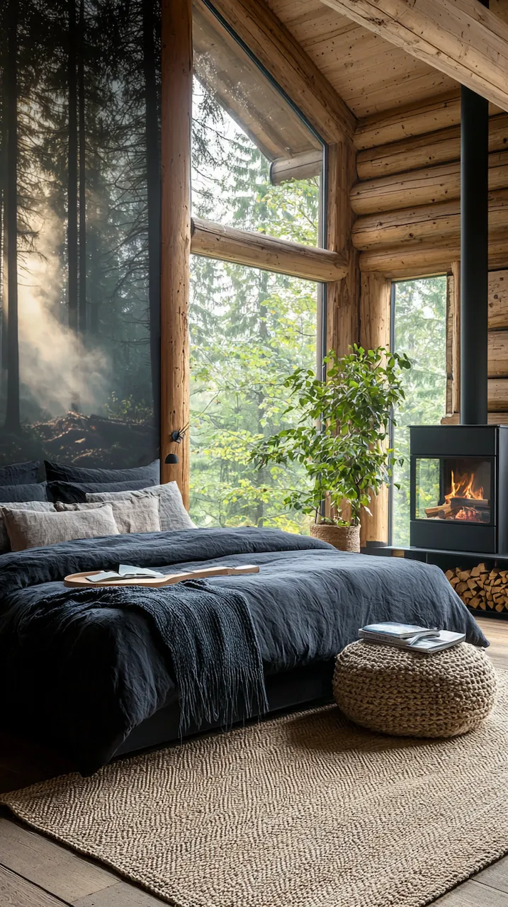
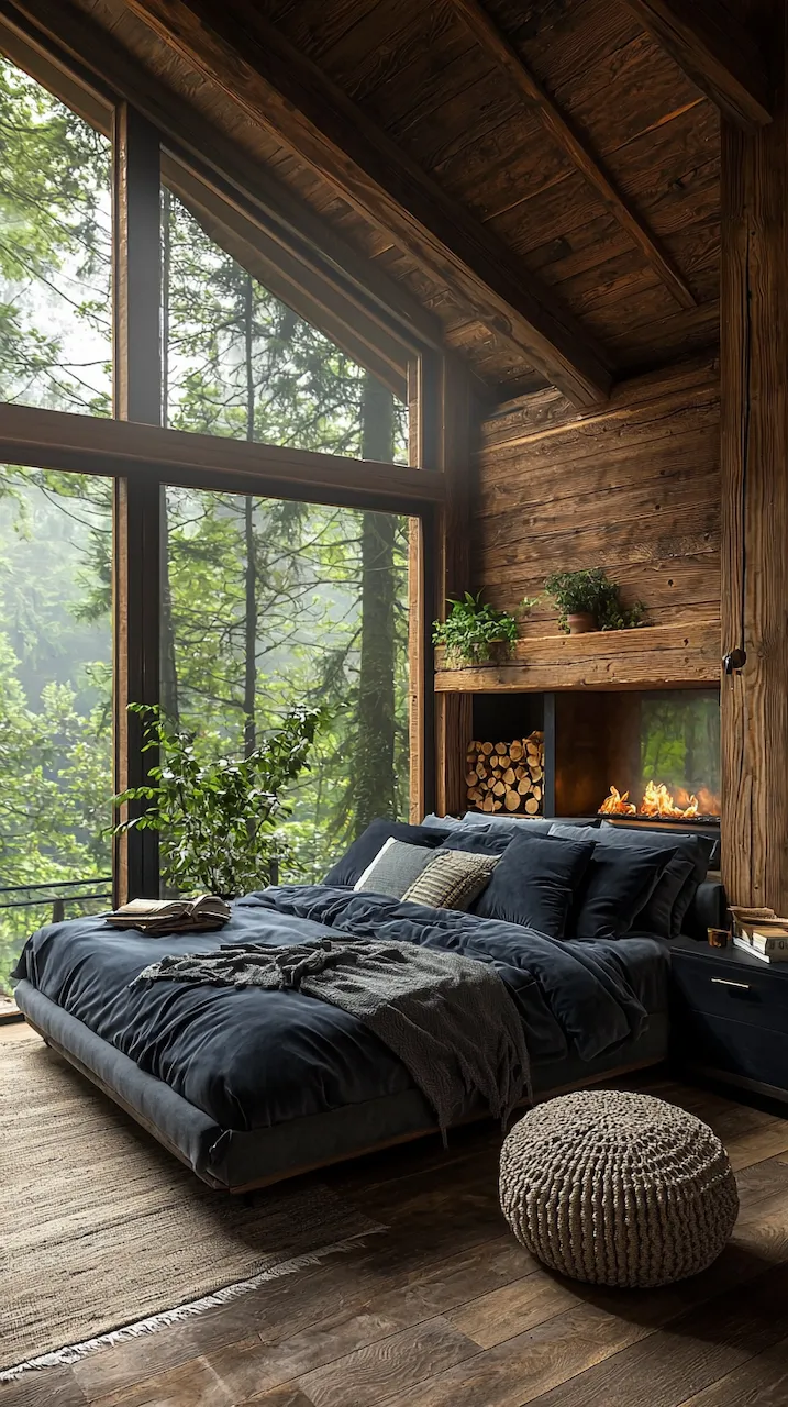
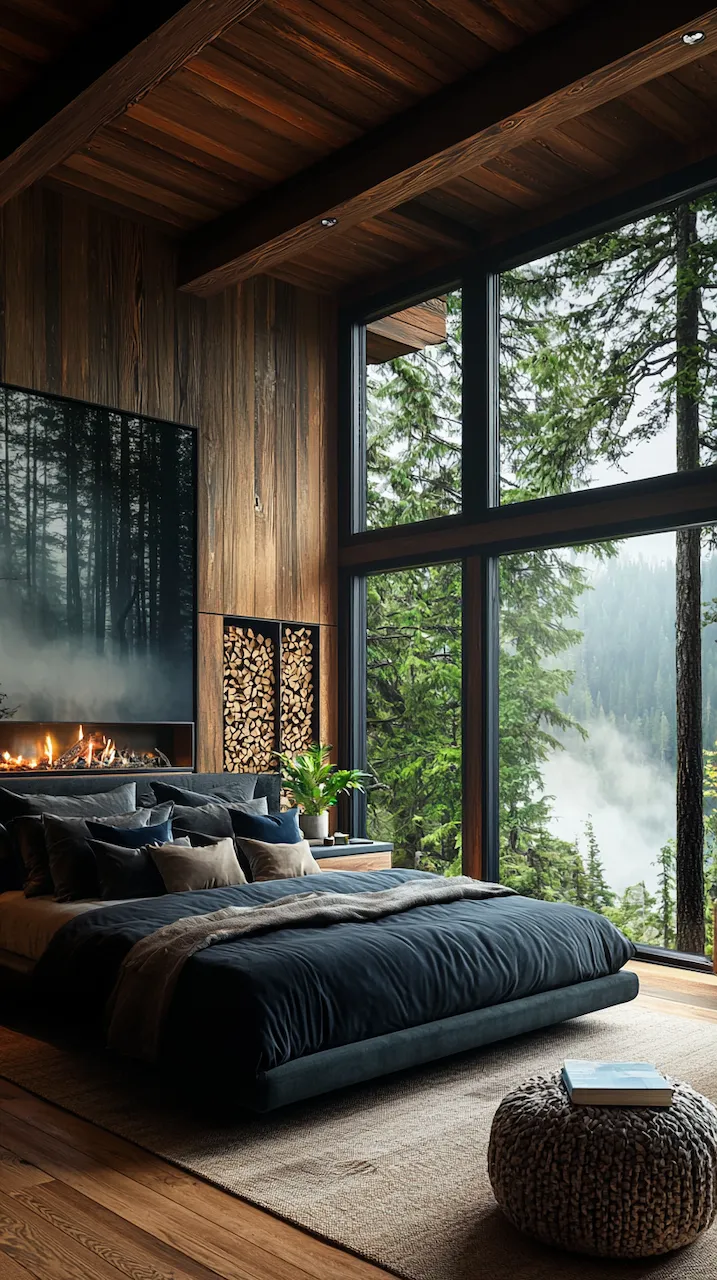
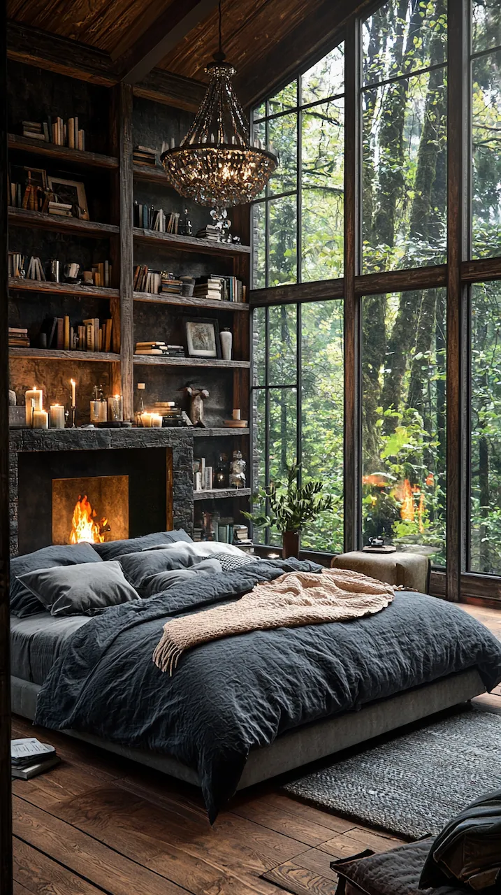
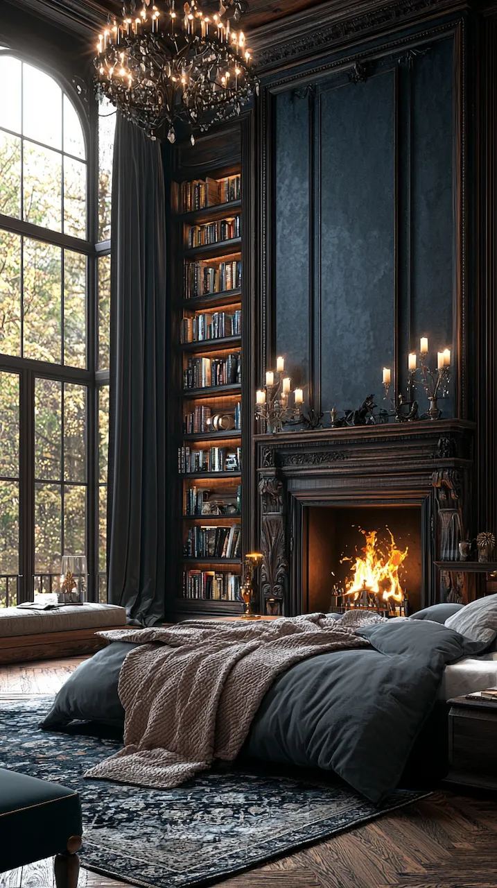
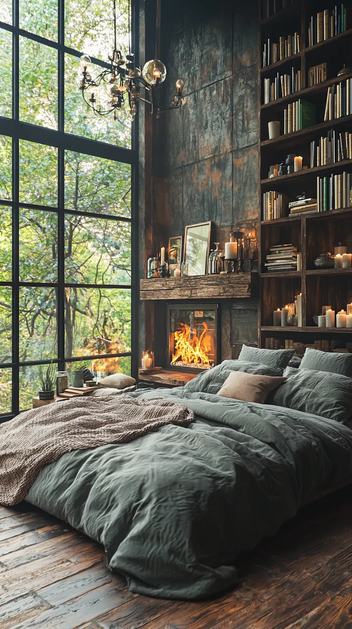
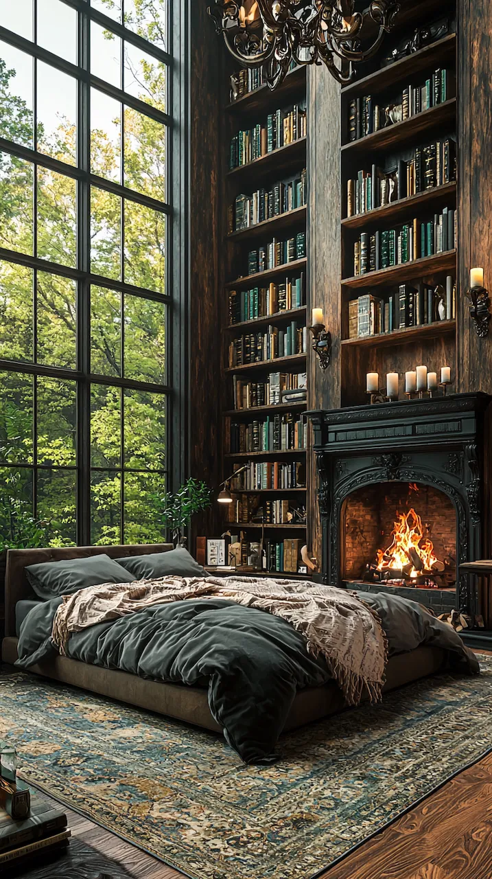
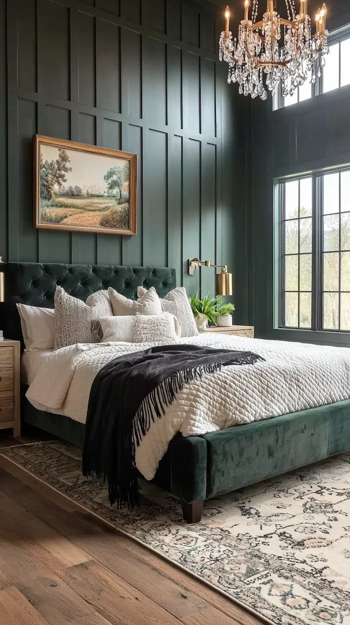
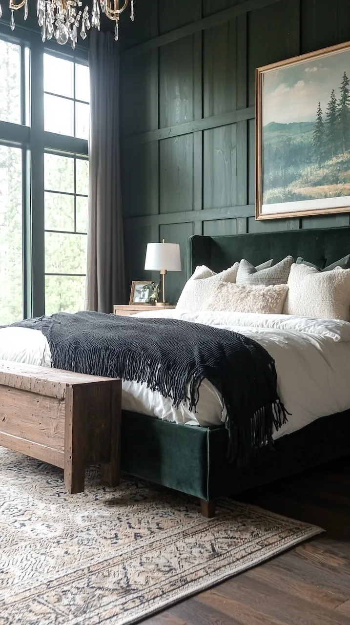
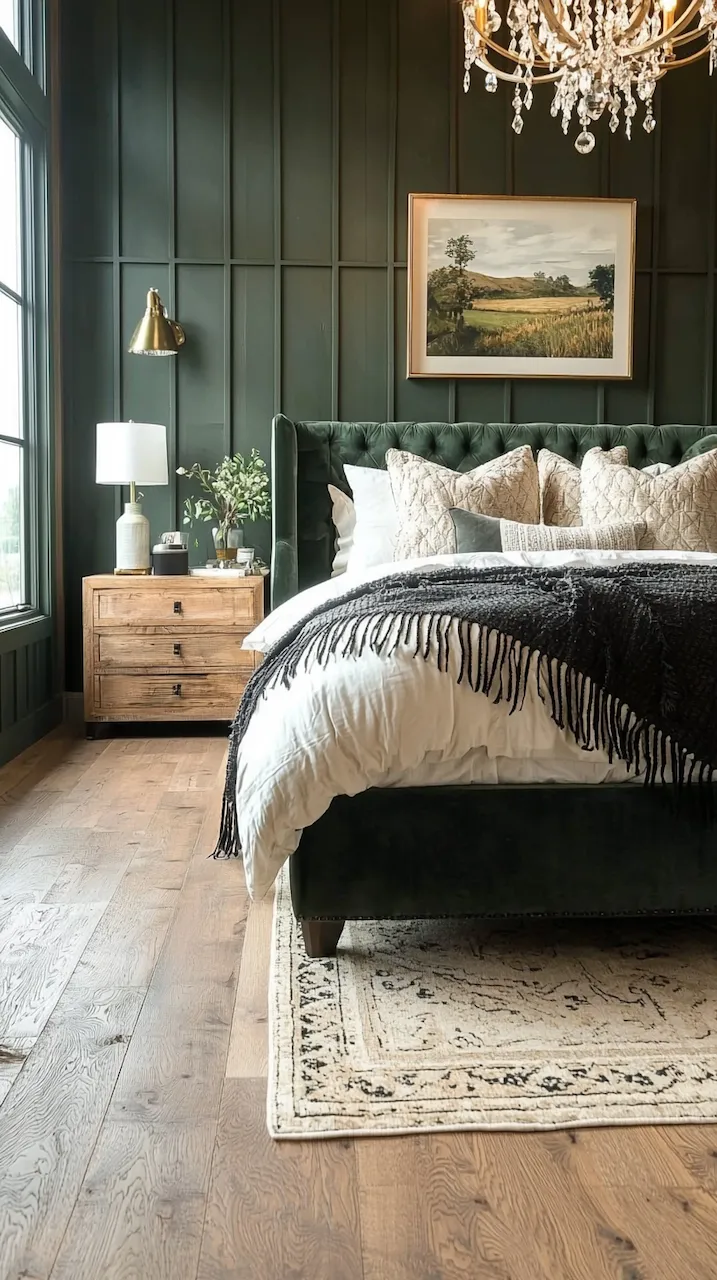
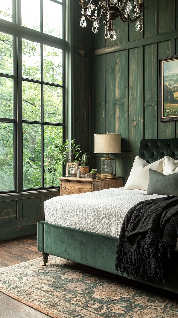
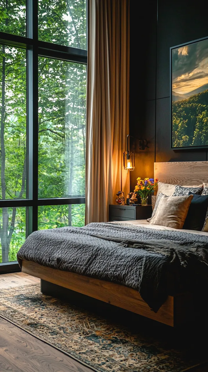
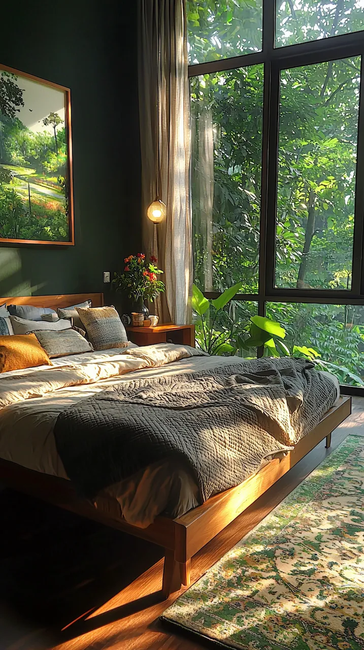
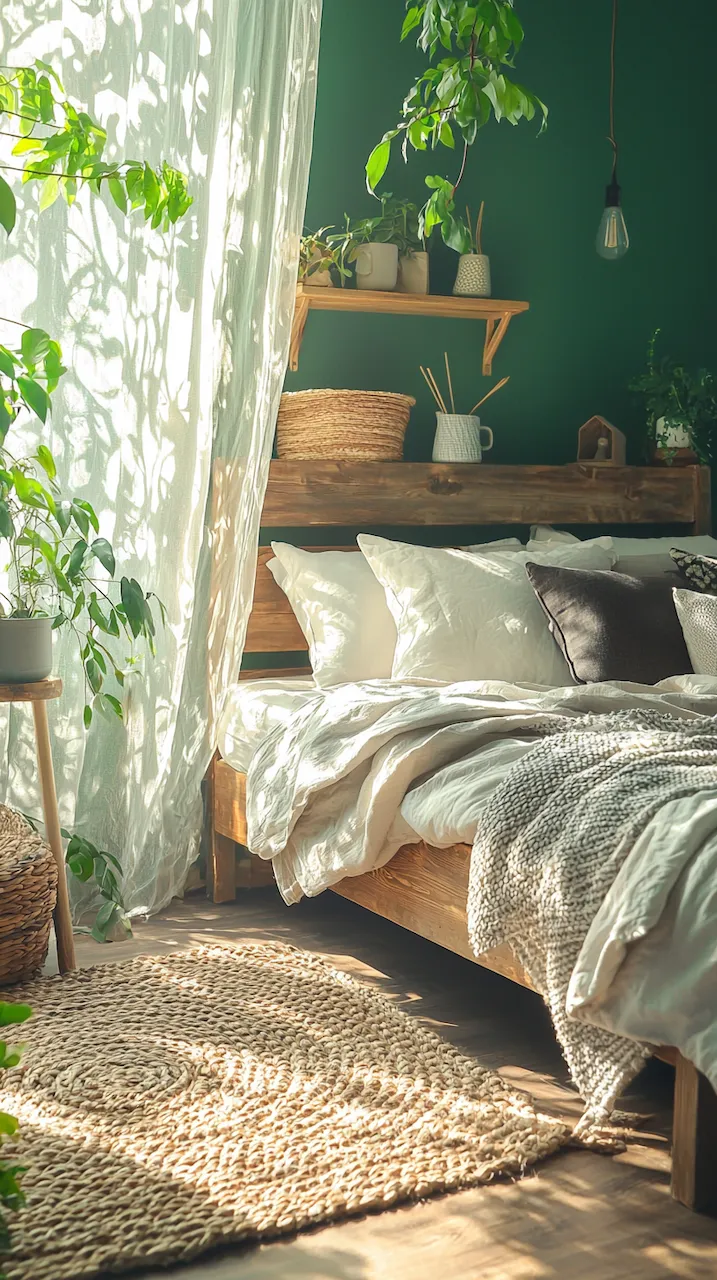
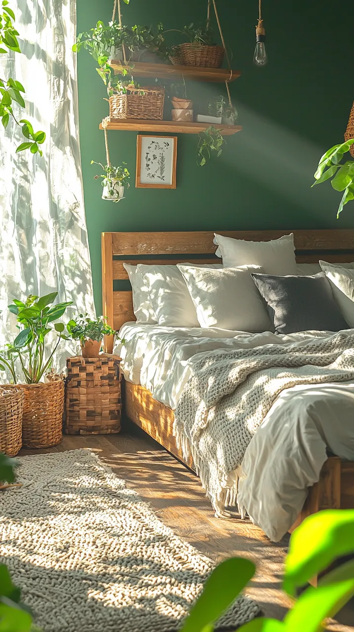
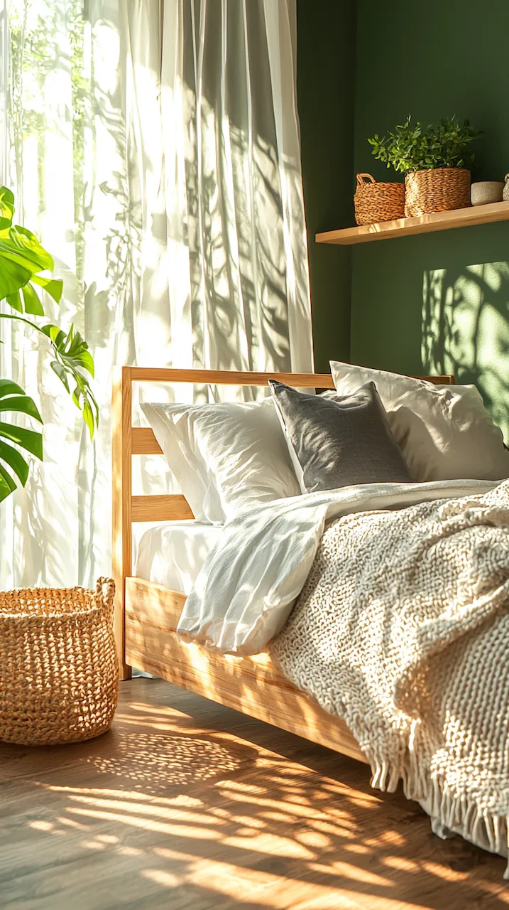
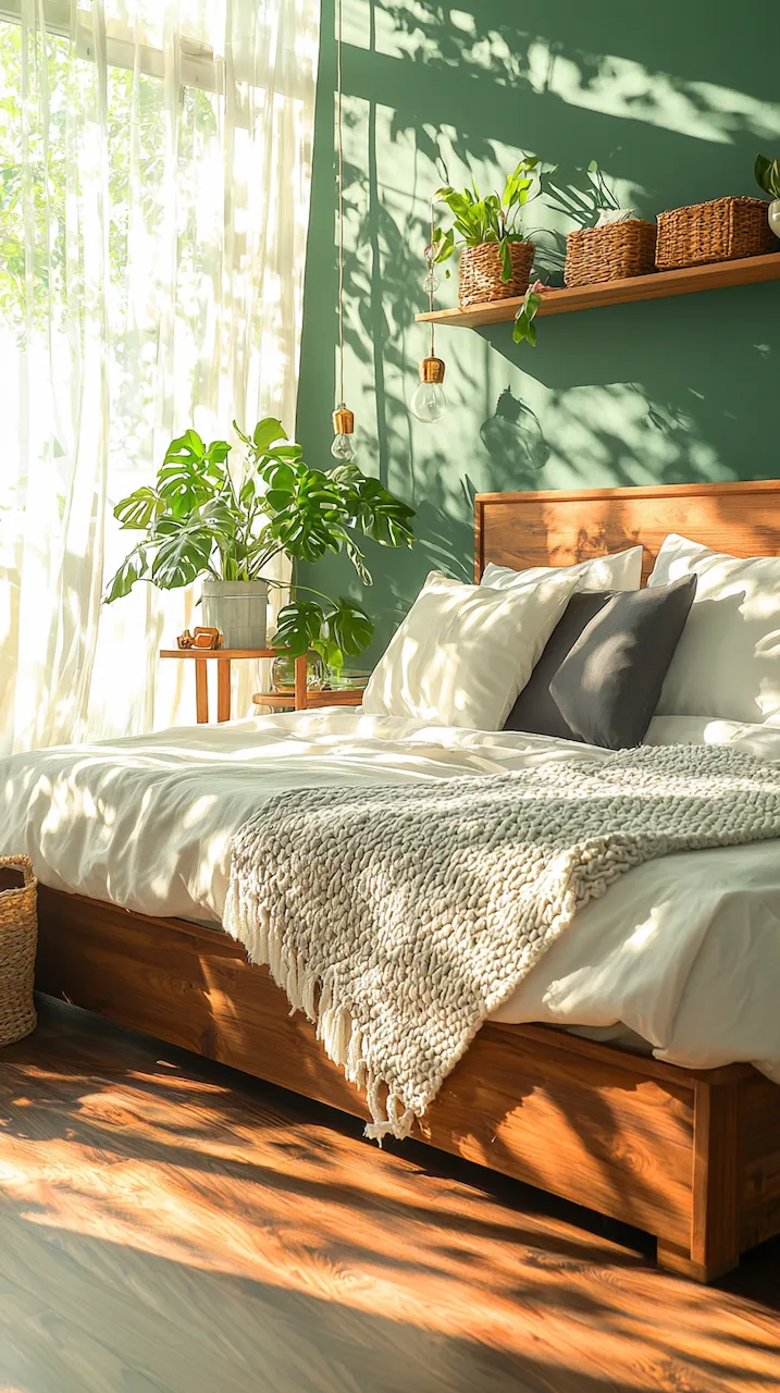
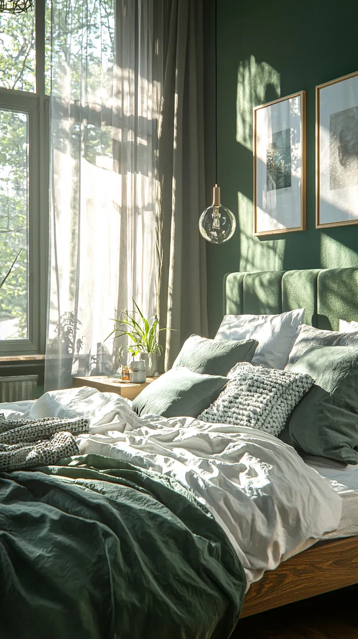
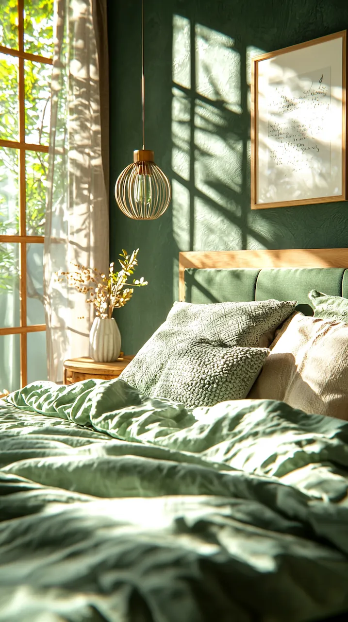
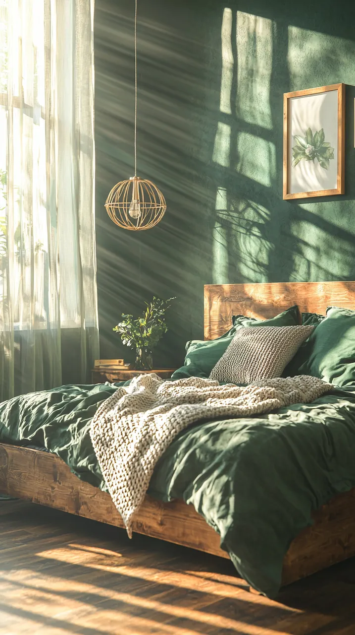
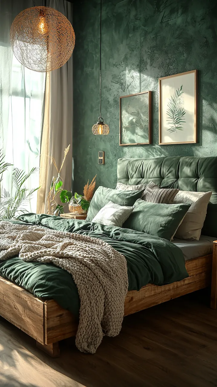
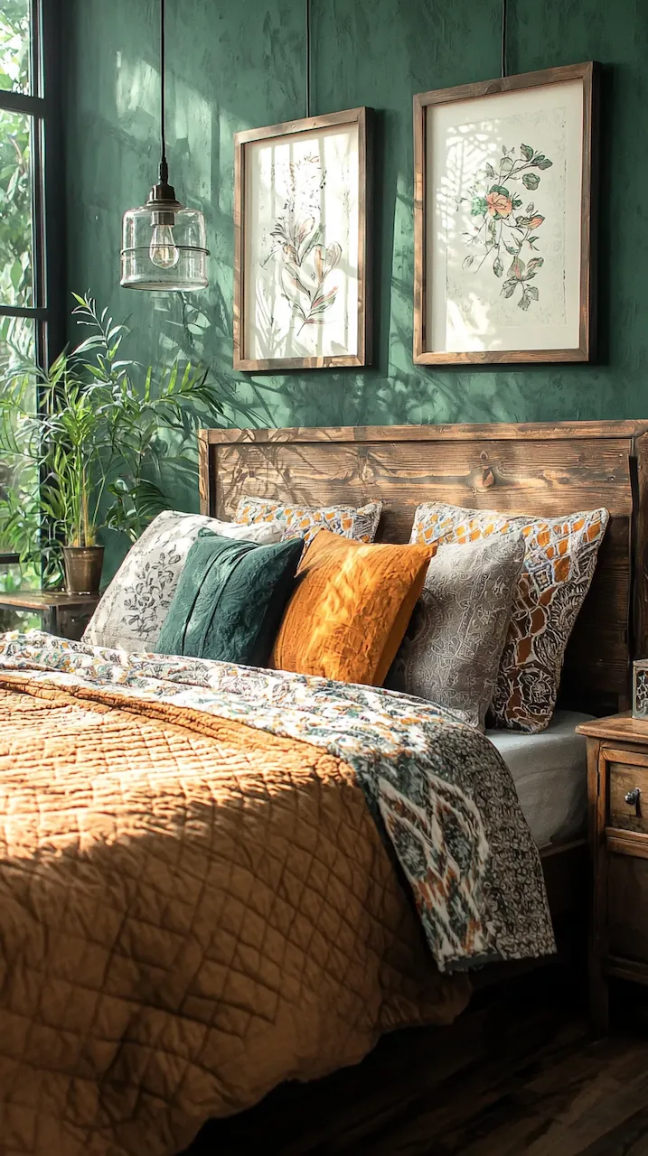
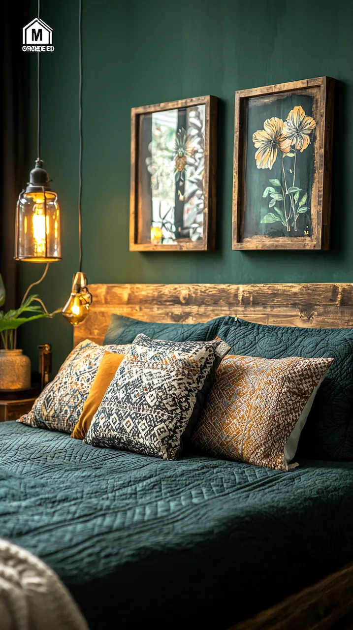
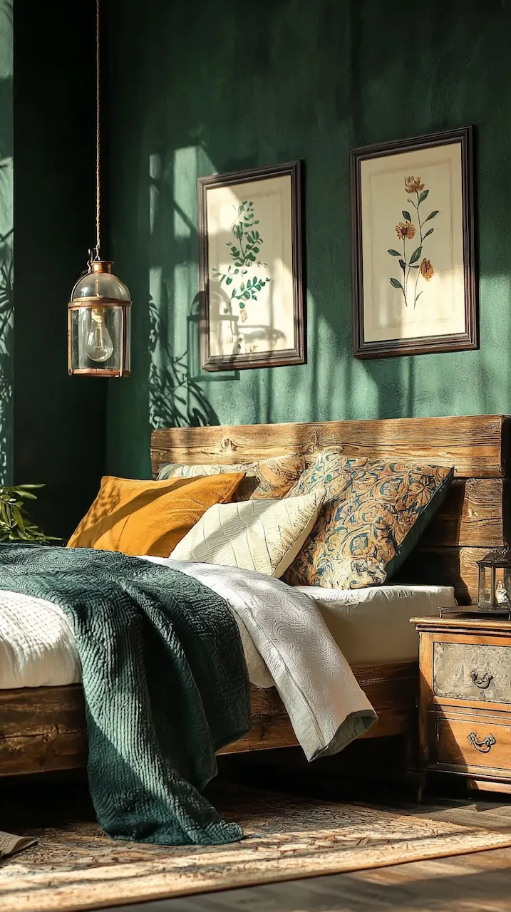
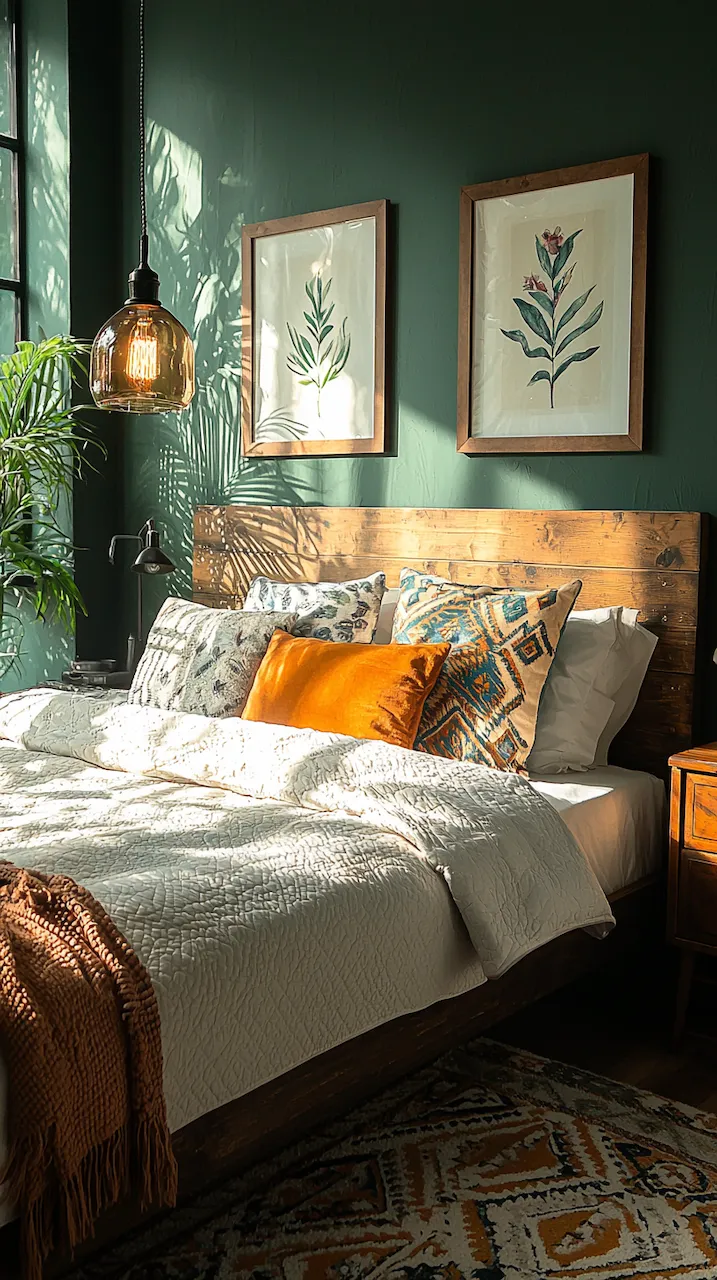
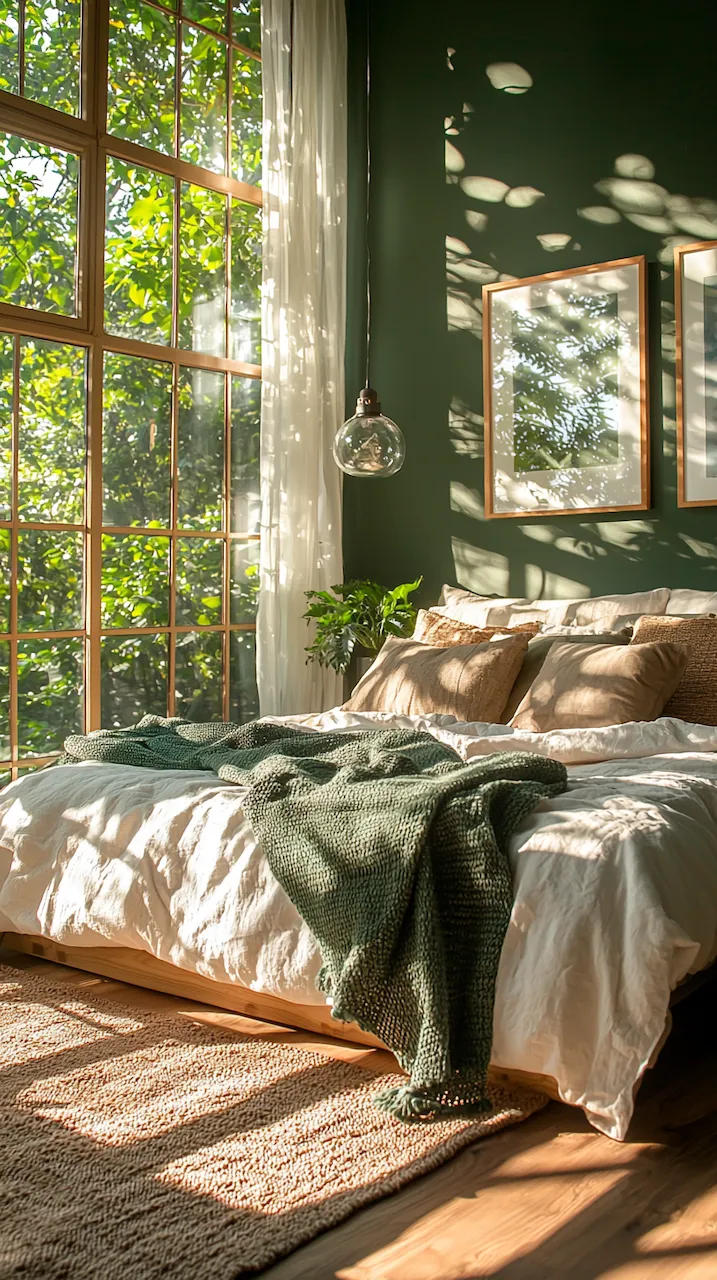
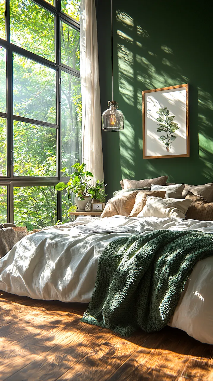
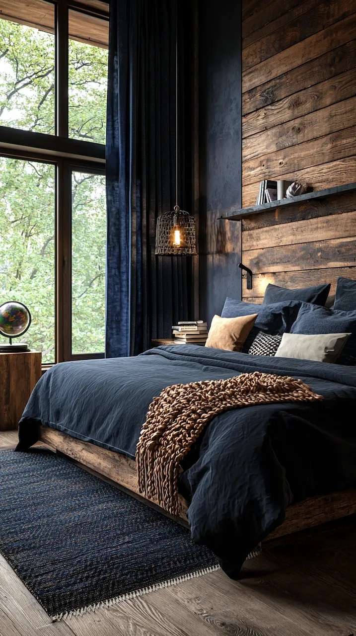
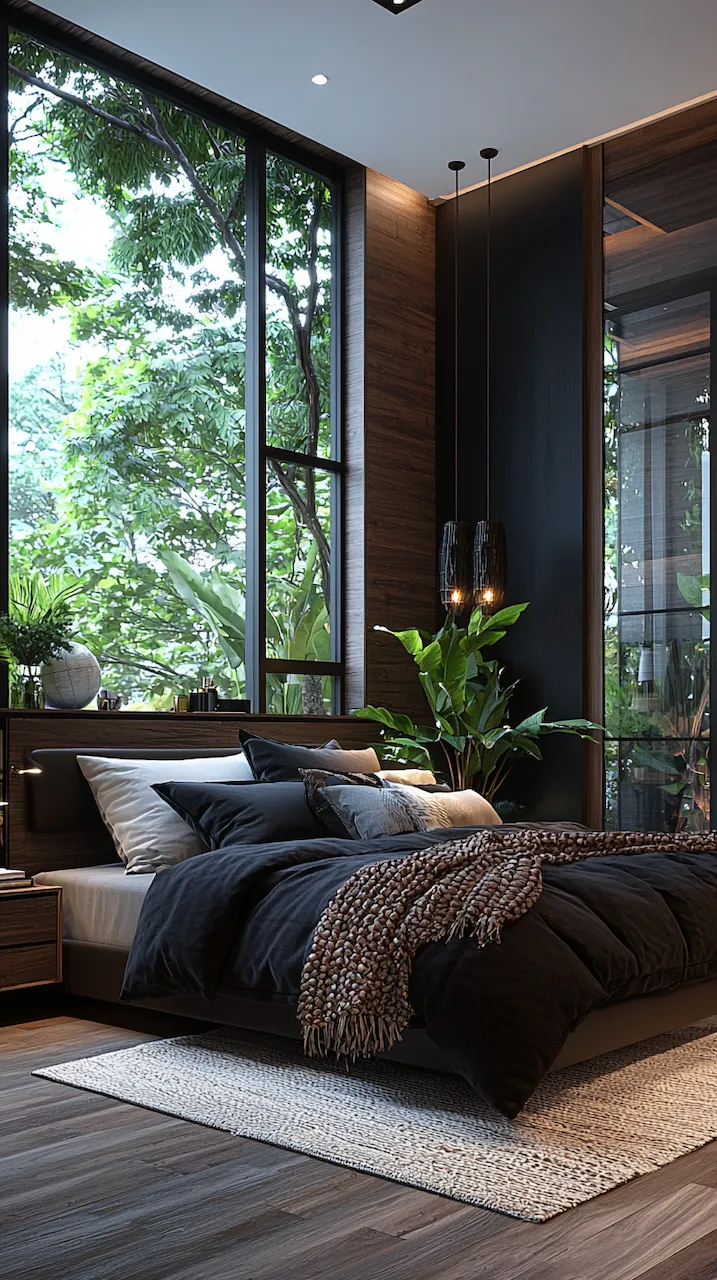
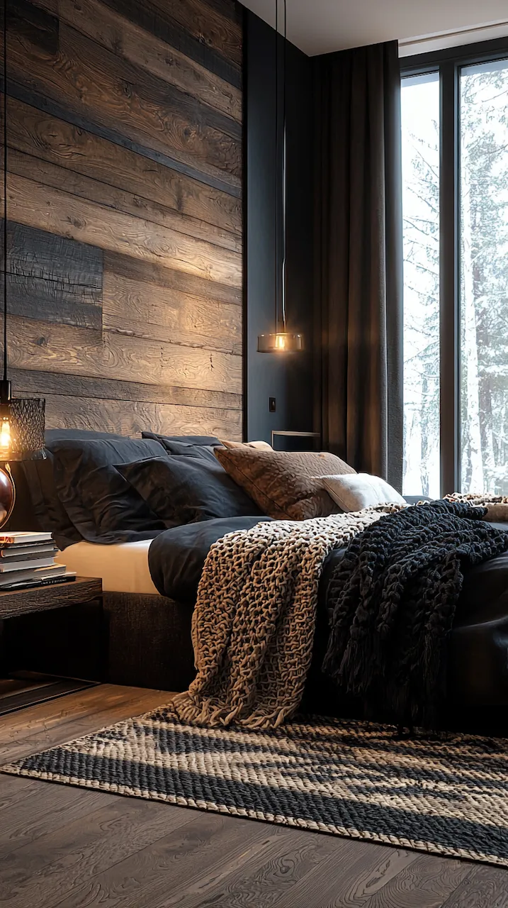
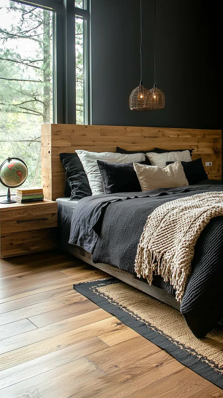
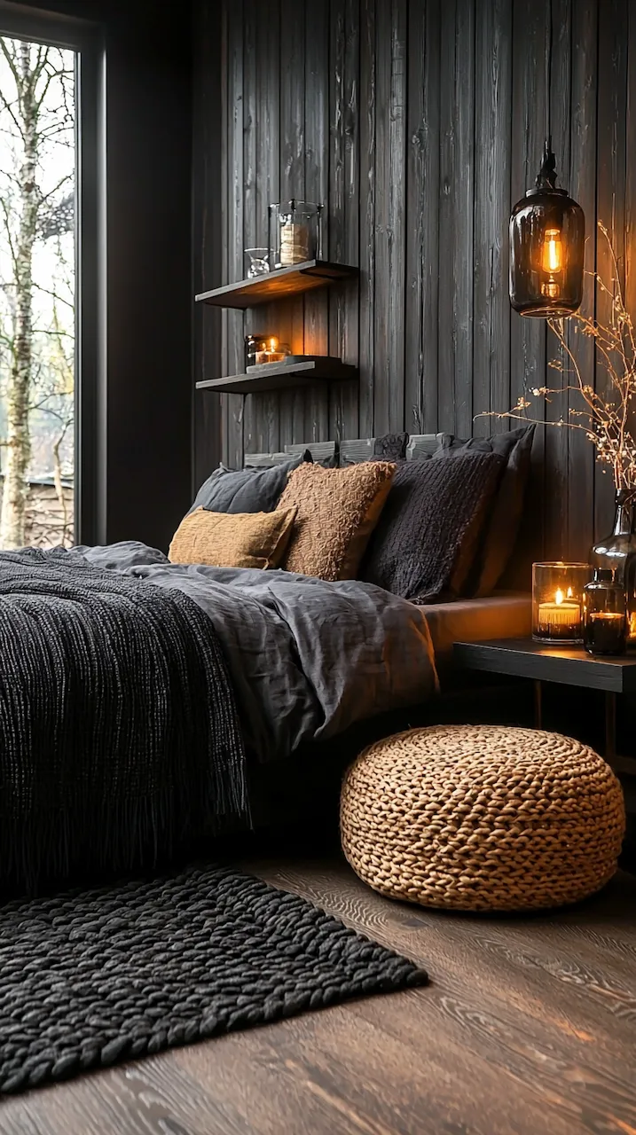
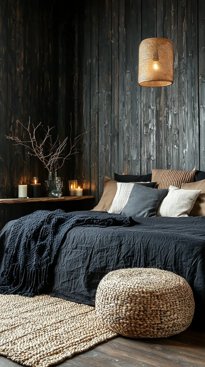
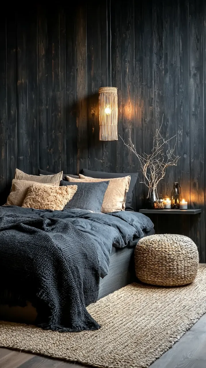
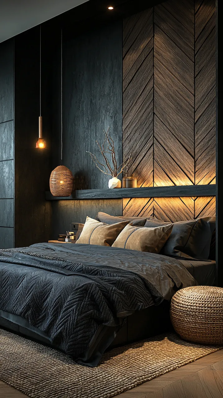
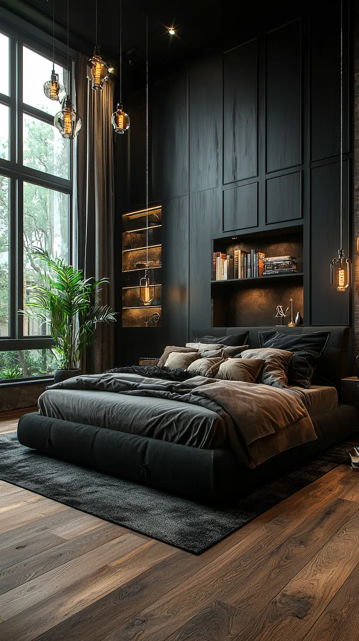
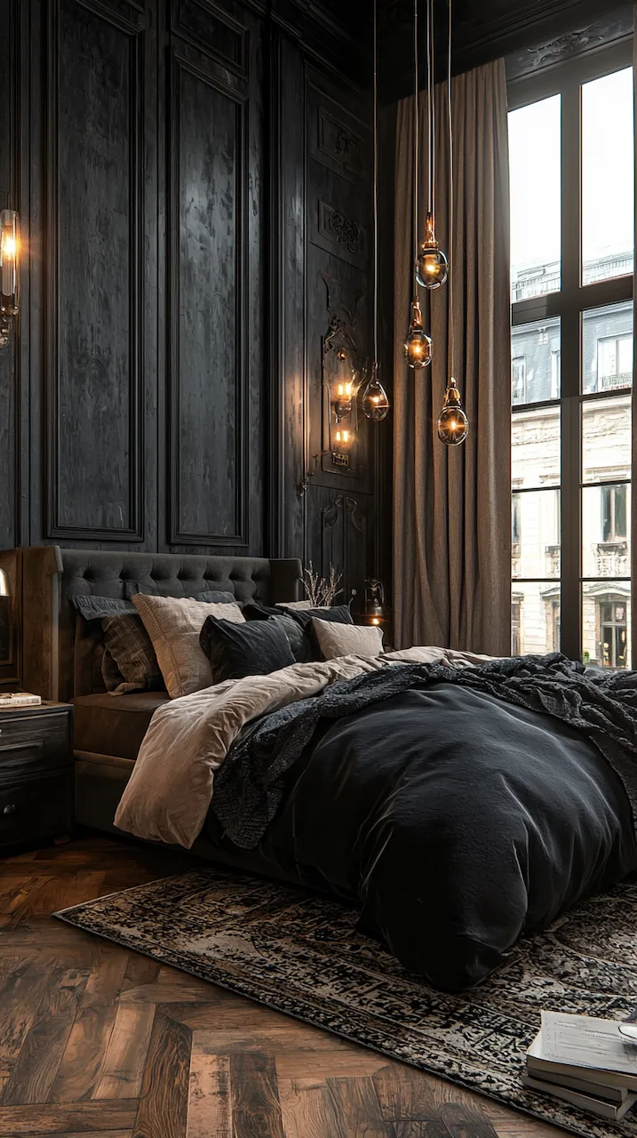
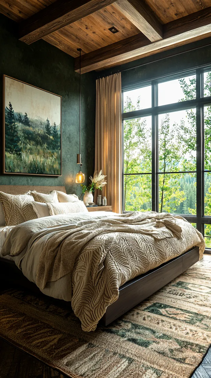
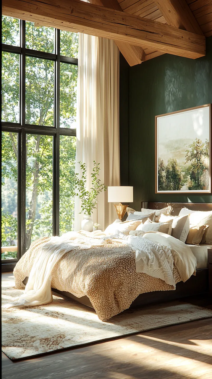
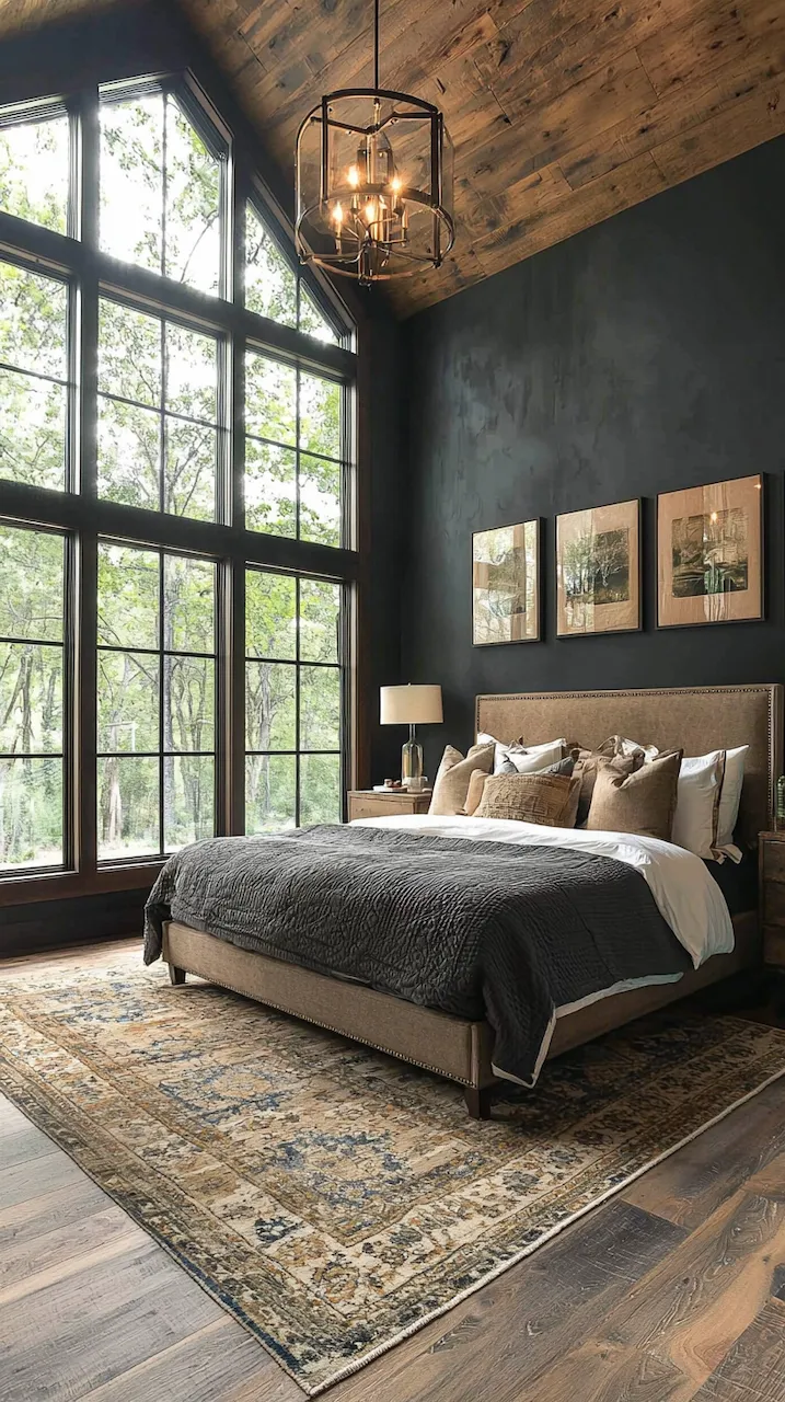
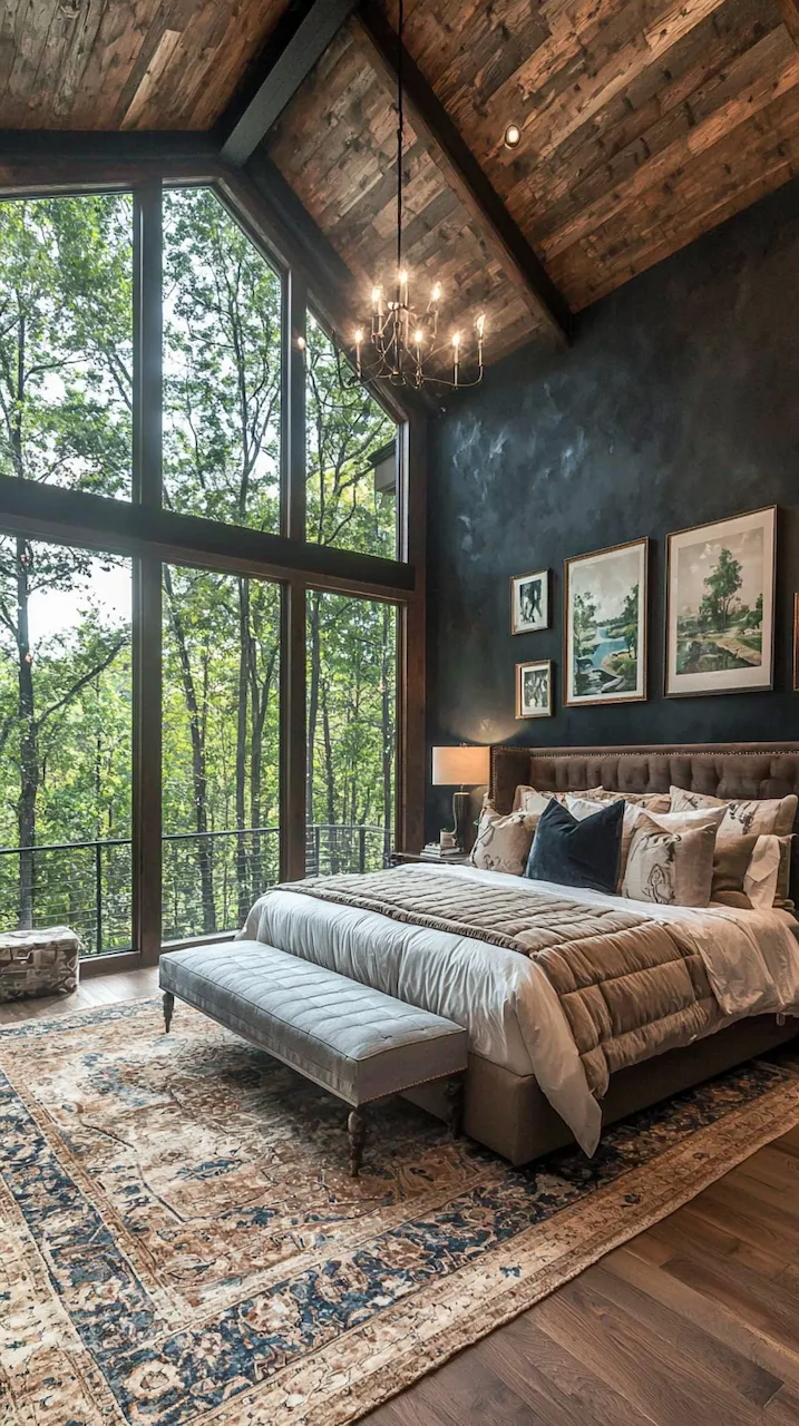
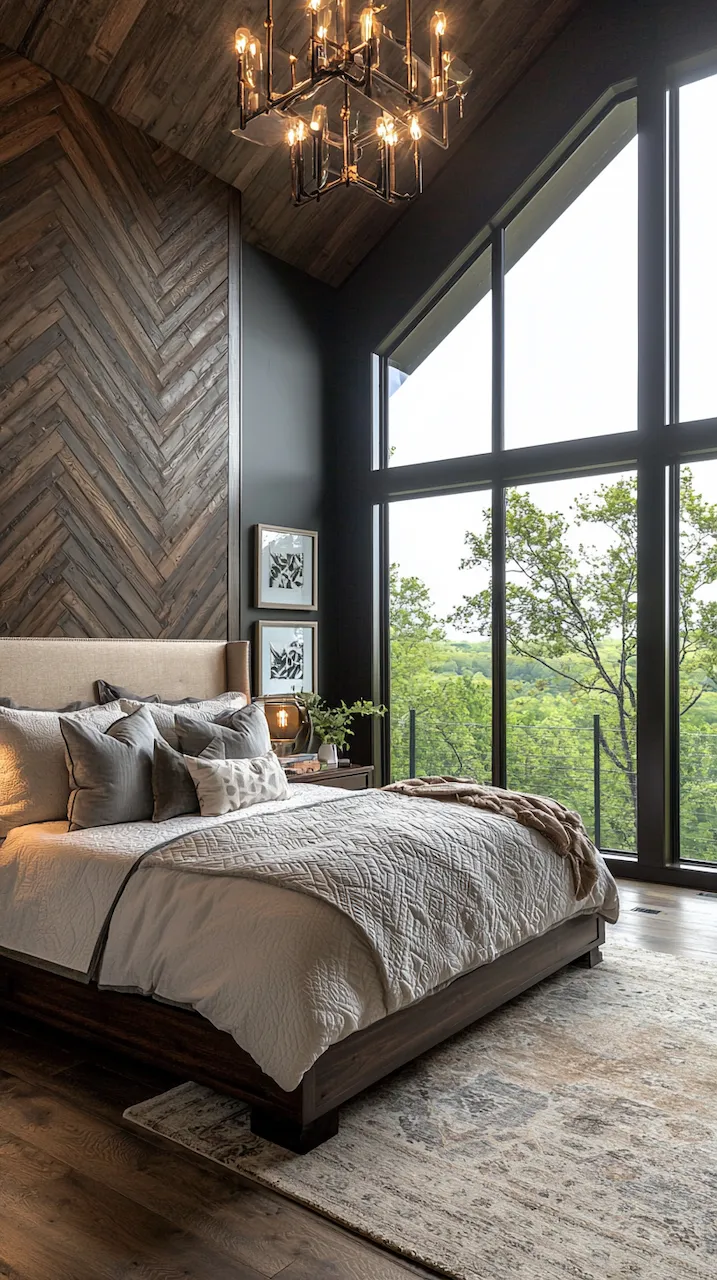
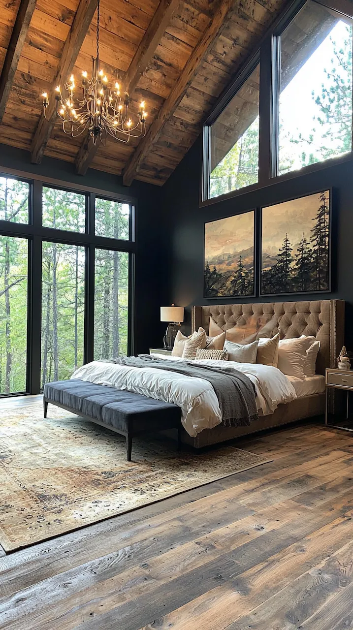
Dark paint colors, such as charcoal, espresso, and deep navy, are often used to set the tone, but it’s the structure around them that ensures they feel sharp rather than suffocating. Imagine a wall painted in obsidian black — flat and bold — but trimmed with crisp, linear moldings that add a sense of rhythm and control. It’s this interplay of shadow and structure that elevates a space from dramatic to architectural.
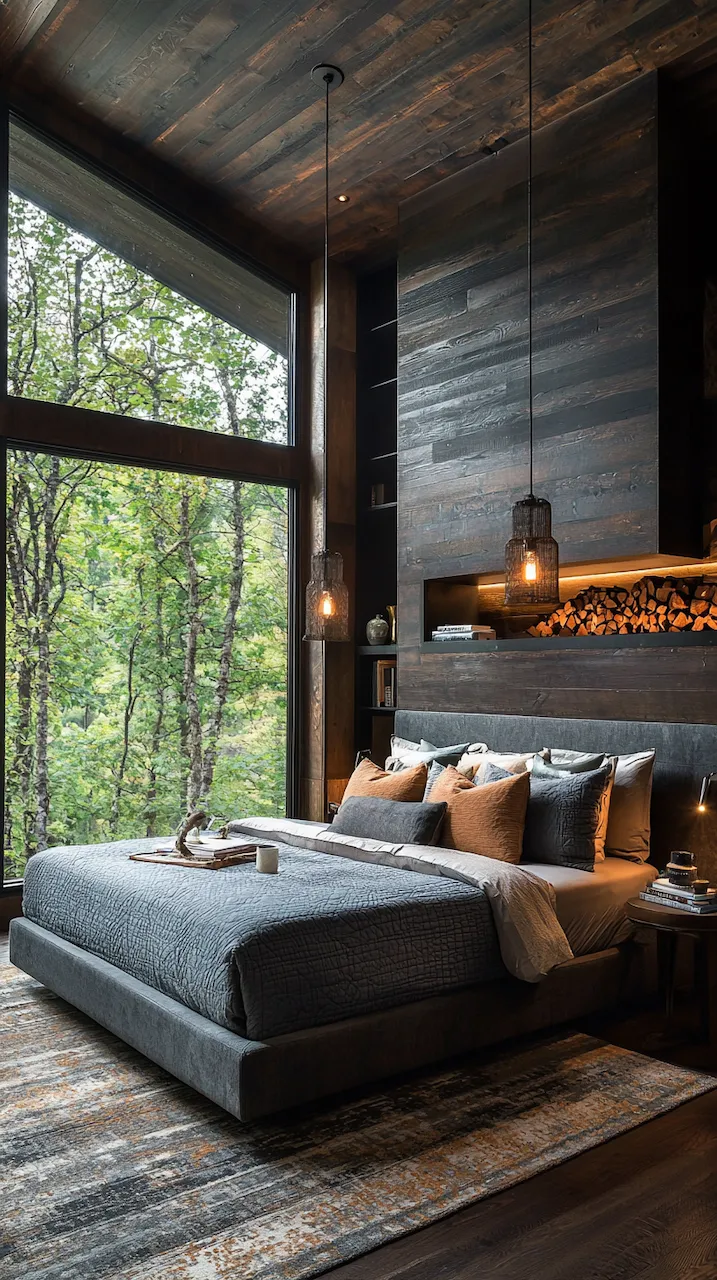
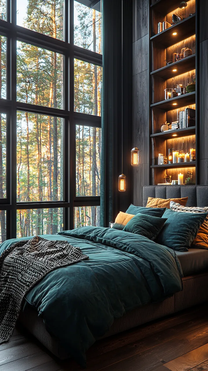
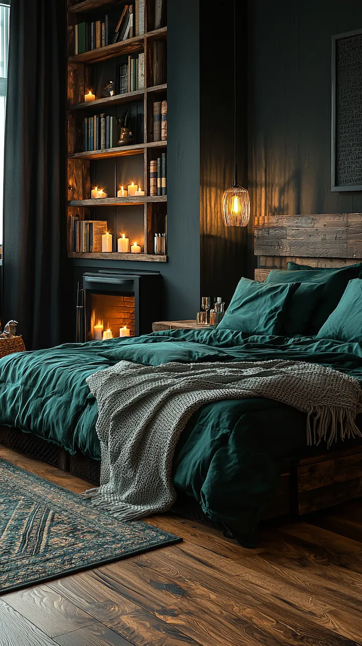
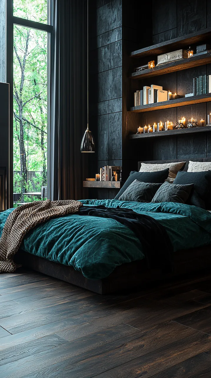
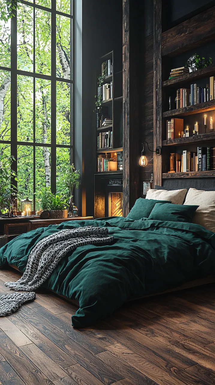
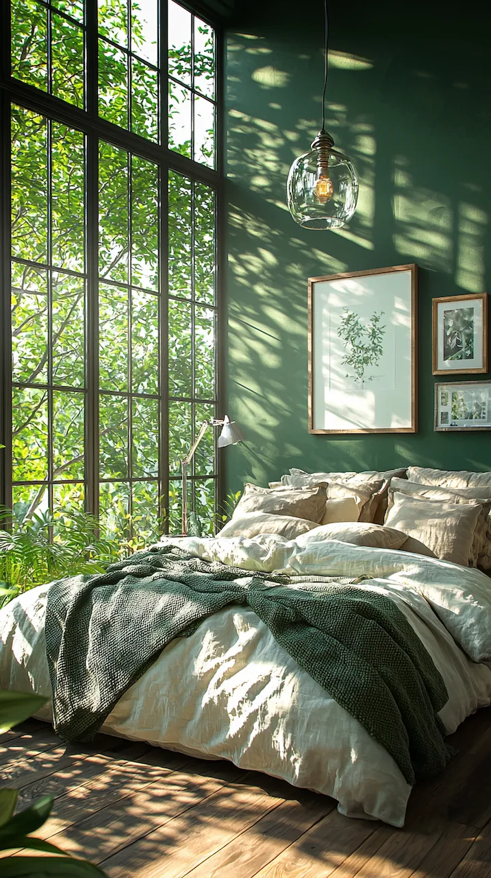
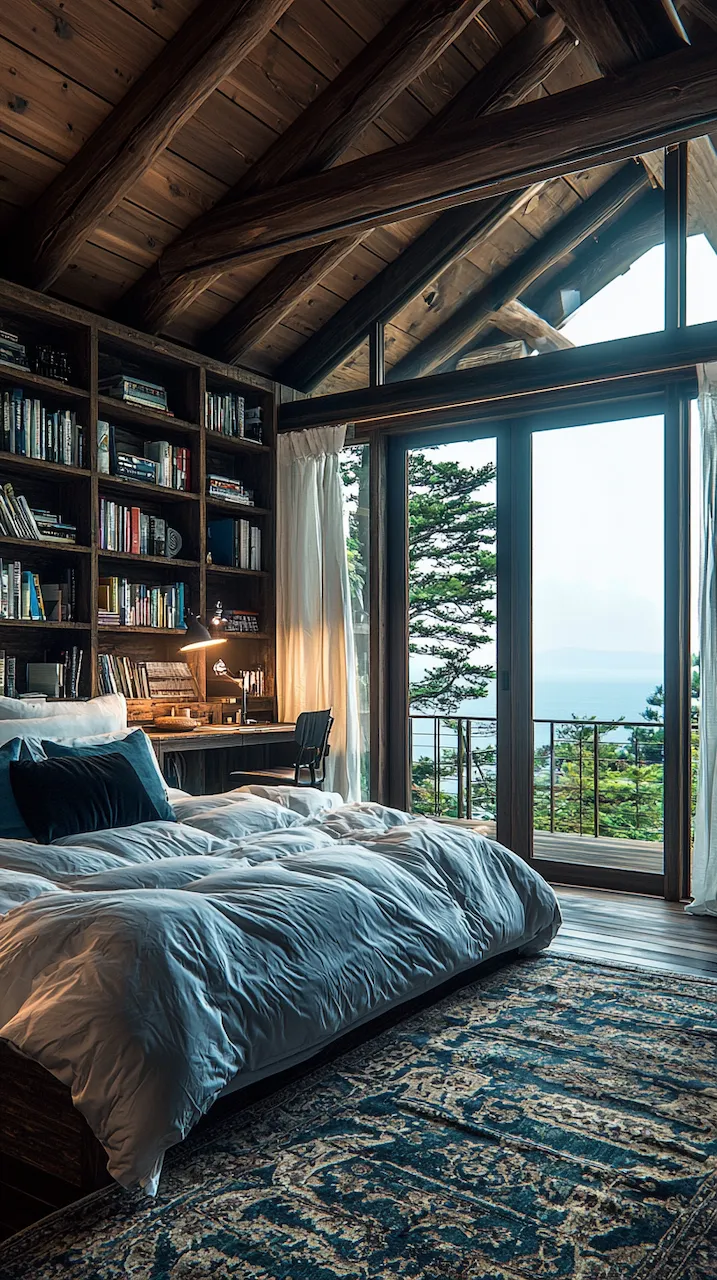
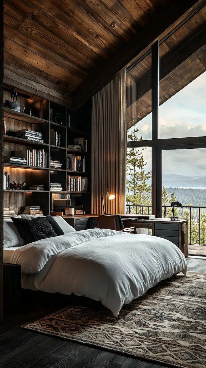
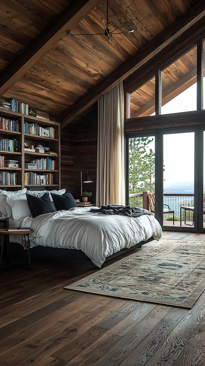
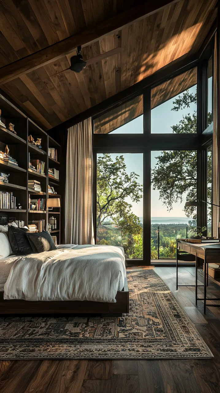
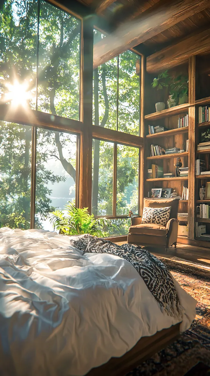
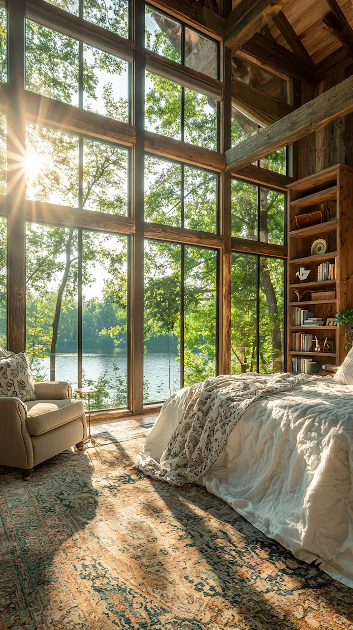
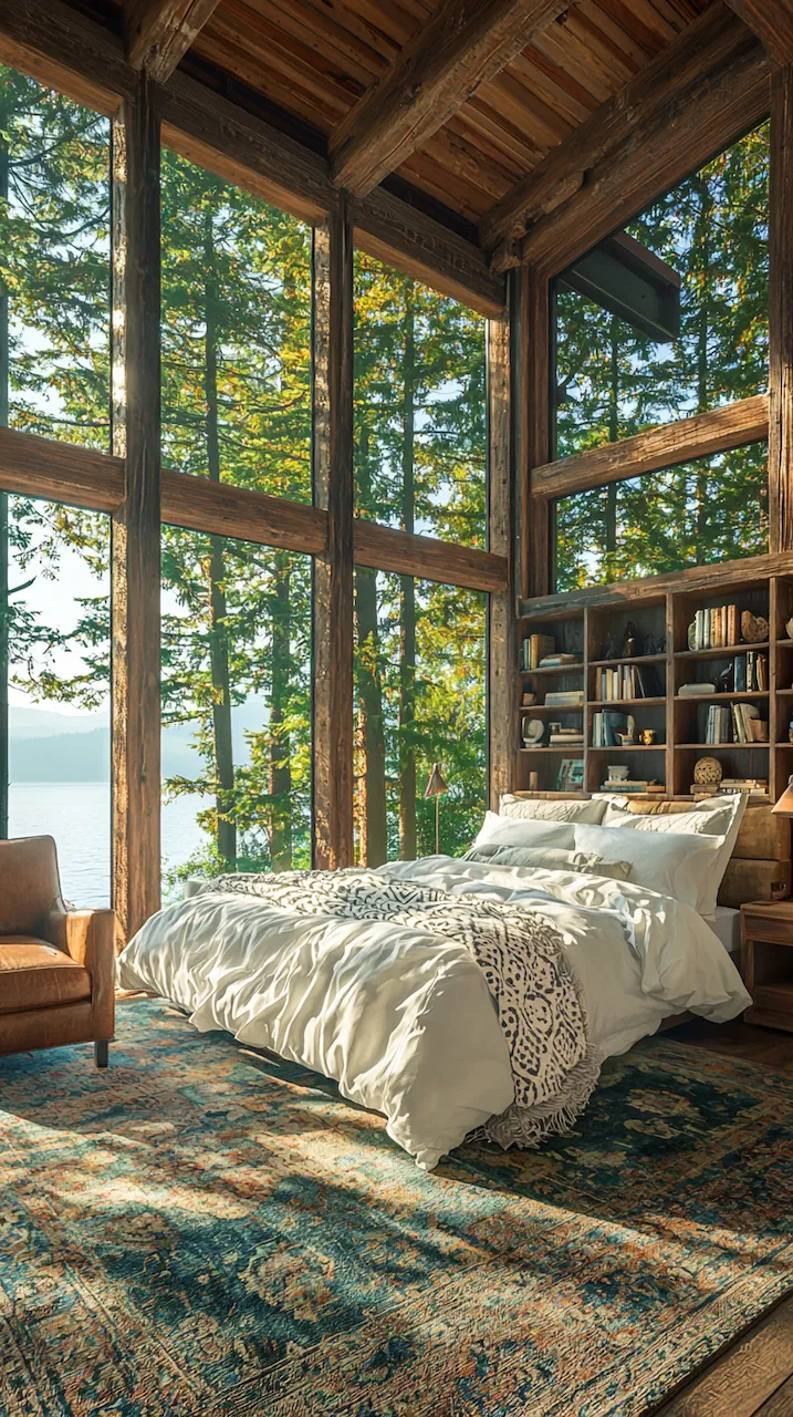
Built-ins become the unsung heroes of small or moody bedrooms. Floor-to-ceiling shelves in matte black or deep walnut provide vertical interest while housing curated collections that soften the intensity of dark tones. Think stacked art books, ceramics in muted glazes, or even color-blocked vintage novels arranged with sculptural intent. These built-ins function like gallery walls: curated, storytelling, and deeply personal.
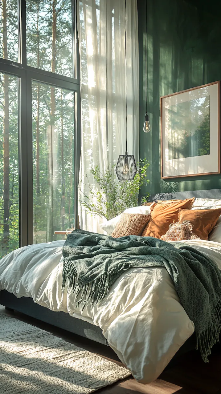
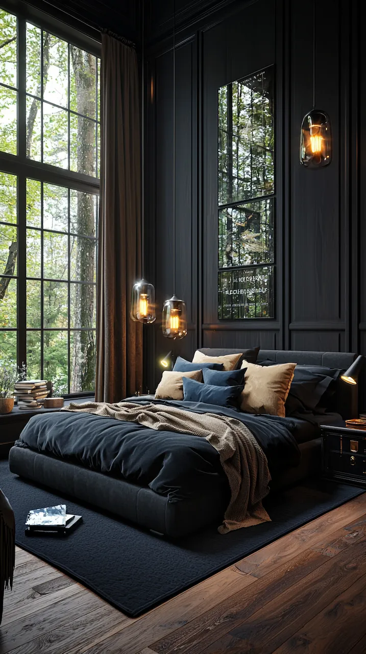
Ceiling treatments are another layer often ignored. Coffered ceilings in dark woods or painted grays can draw the eye upward, balancing the horizontal compression that dark walls can create. Architectural lighting — recessed, track, or directional sconces — can then be layered to wash these surfaces in controlled glows, softening and highlighting the space’s geometry.
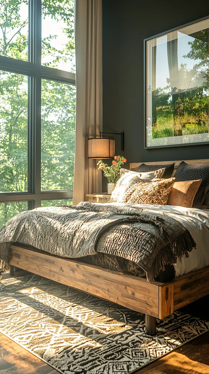
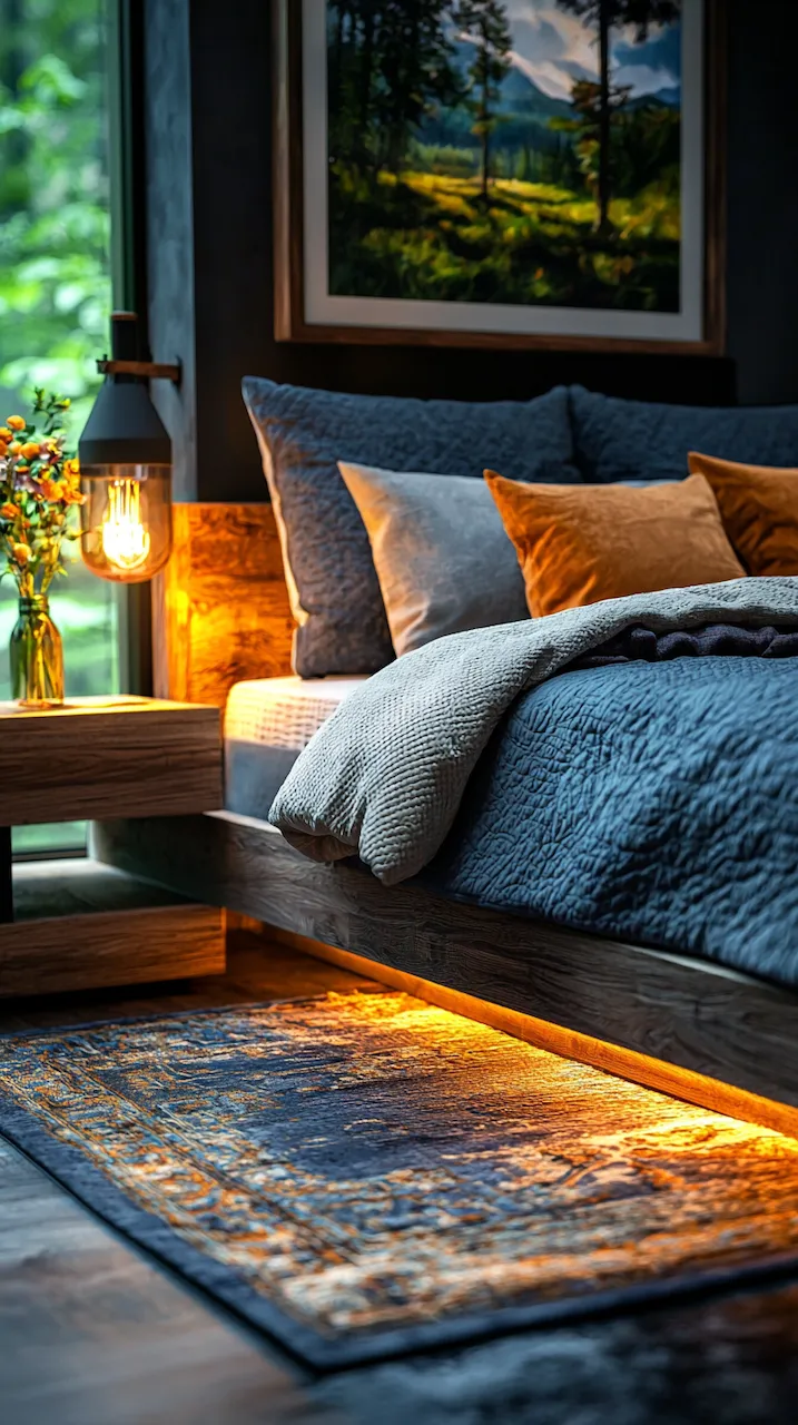
The bed itself, often the center of attention, should act as both sculpture and sanctuary. A high-back headboard upholstered in velvet or boucle in a deep, tactile tone creates a sense of protective enclosure. Flanking it with low-slung nightstands in contrasting finishes — maybe blackened brass or raw-edge stone — adds texture and functional asymmetry. Each piece has weight and mass; each placement has intent.
In compact urban homes, the structure extends to smart zoning. Platforms create spatial distinction: a low plinth under the bed gives a sense of architectural anchoring. Dividers, such as smoked glass panels or linen curtains on blackened rods, can demarcate dressing or working areas without closing off light or air. Structure, in these designs, is not about rigidity, but about giving form to function and allowing emotion to unfold within clear spatial narratives.
Even the windows, often treated as afterthoughts, deserve sculptural attention. Instead of gauzy curtains, imagine floor-to-ceiling panels in heavy wool or silk, pleated in precision, framing the darkness with intentionality. Hardware in bronze or matte iron extends the material language, reinforcing the rhythm of the room.
This is structure not as skeleton, but as philosophy. A moody bedroom with dark accents succeeds not because it is trendy, but because it has a point of view. It knows what it wants to say and says it fluently — in the language of lines, levels, and the light between shadows.


The Power of Asymmetry
Symmetry is safe. It’s what you find in hotel rooms and catalog layouts: two identical nightstands, two matching lamps, centered artwork. But design-forward thinkers and creative professionals have moved past symmetry’s predictable grip. In moody bedrooms, the unexpected reigns. Asymmetry injects narrative tension, and tension creates emotional gravity.
The power of asymmetry in dark-accented bedrooms is that it challenges the eye and rewards the observer. A singular pendant light, for instance, may hang to the left of the bed, casting a pool of soft golden light over a sculptural chair in marbled resin. On the opposite side, perhaps a built-in shelf floats mid-wall, hosting a rotating collection of design books, vintage Polaroids, and ceramics that look like they were dug from a Scandinavian forest.
What makes asymmetry successful isn’t randomness, but balance through intention. The goal is not chaos, but composition — the kind that feels like jazz: structured, yet improvisational. Asymmetry allows for hierarchy in the visual field. It invites moments of pause. Your eye lingers longer on what isn’t immediately obvious.
In spatial planning, asymmetry becomes a way to disrupt expectations. Instead of centering the bed on a wall, why not angle it into a corner framed by a custom bookshelf that bends with the architecture? Rather than symmetrical artwork, perhaps a massive statement piece leans against the wall, balanced by nothing but negative space and nerve. That absence? That’s design.
Asymmetry also allows for personality to breathe. It makes space for the quirks — the vintage baroque mirror inherited from your aunt, or the brutalist lamp scored at a flea market in Marseille. These aren’t matching elements; they’re statements. And in a dark-toned bedroom, where every object has more visual weight, these contrasts become even more potent.
Consider textiles: a bed layered with asymmetrical throws — one draped with nonchalance, another folded with surgical precision — tells a story of duality: order and abandon, precision and ease. Throw pillows don’t need to mirror; they can graduate in size or rotate in material — velvet to silk to coarse-woven linen — echoing the visual rhythm of the room.
Lighting plays a critical role in accentuating these choices. Dimmers, directional spots, and sculptural fixtures can isolate corners or highlight moments. A spotlight on an offset painting. A wash of indirect light down a rust-toned concrete wall. These lighting gestures don’t aim to unify but to accentuate difference.
Asymmetry in moody bedroom design also echoes larger cultural themes: the move away from perfection, from rigidity, from the sterile minimalism of early 2010s design. Instead, it reflects the contemporary ethos of embracing contradiction, nuance, and personality. It’s no longer about everything matching; it’s about everything mattering.
In this space, imbalance is a kind of honesty. It says: I’m not here to perform serenity. I’m here to inhabit complexity. I want beauty, but I want it to be complicated, soulful, real. In a world that often craves simplicity, asymmetry offers depth. And in a bedroom, that depth translates into something deeply human: a space that feels lived in, thoughtful, and awake even when it’s meant for rest.